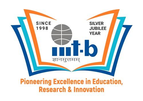
“Design is not just what it looks like and feels like. Design is how it works”, said Steve Jobs. This thought process is relevant to IIIT Bangalore’s silver jubilee year logo which was designed by Mr. Manoj HP, Designer at IIIT Bangalore. Manoj’s design was chosen among the 8 entries submitted by students, alumni, faculty and staff who participated in the contest was awarded with Rs 10000 on foundation day. He is behind the unique and aesthetic designs of various creatives for the last three years at IIIT Bangalore. A Designer’s role is to create something new every single time, which is in contrast with any other conventional roles of an organisation.
In a freewheeling conversation with Naviiina, Mr. Manoj unwinds the multi-layered design principles behind the silver jubilee year logo.
The Inspiration:
He derives his inspiration from three prominent figures,
Primarily from Mr. Paul Rand, the father of graphic design. His notion was that graphics and type are a continuum and when done right coherence can be achieved. According to him, A good design should emphasize utility rather than only beauty.
Secondly from Mr. Steve Jobs, founder of Apple. His prospect of combining art and technology in order to bring the best of the design that can impact lives.
Finally, Mr. Manoj also looks up to Mr. Don Norman, who is widely regarded for his expertise in the fields of Human-centric design (HCD) and usability engineering. His vision of keeping designs Human-centric, simple and utilitarian.
The Challenge:
Creativity is not always a crowing stroke for a graphic designer, he elucidates the challenges of being a graphic designer, “Unlike an artist, who doesn’t have any limitation to create an art, graphic designer’s work is derived by purpose, constraint and technology.”
Design is subjective. Any design you comprehend is the result of several decisions made by one or more designers and most carry some measure of subjectivity implying that a design cannot be perfect. However, Mr. Manoj counters the statement and says, “Perfection is Achieved Not When There Is Nothing More to Add, But When There Is Nothing Left to Take Away”.
A true designer’s job is to catch a free-flowing simple idea, add a complex thought process to it and rigorously analyse people’s perception of things. He has to put all this together and come up with something so simple, that it looks like anyone can do it in a minute, making it look effortless.
An enormous thought process and meticulous design planning were the important components of this prize-winning silver jubilee year logo of IIIT Bangalore.
The Plot:
“The contemporary world thrives heavily on branding and the logo is an integral part of branding. The main logo of the institute has positioned itself as a well-known logo by itself and it is the true identity of IIITB. We should never dilute the identity of established brand and thus it was decided to embed the existing logo in the new design,” Says, Mr. Manoj.
As a first step, he decided to have a simple vector design, inside which the original logo of the IIITB rests. This ensures that one doesn’t crop out or use the new logo as a different unit, but rather considers the whole unit as a single logo
The present IIITB logo was dichromatic but the new age demands vibrancy in designs paving the way to use diverse colours. Any new elements used should be relevant to the educational institute and existing IIITB’s logo had the potential to add more ideas of educational symbolism to it.
It was a wise idea to choose a rectangle over any other basic shapes as a perimeter. A rectangle gives an advantage of making the maximum use of available space, because off all branding placements come as a rectangle. For example, letterheads, visiting cards, websites or computer monitors in general.
The Meaning:
The symbols in the logo convey the most in the logo. Giving it an outline of the book was an ideal approach as a book is synonymous with knowledge. “I decided to keep it open to represent that IIITB is an open and transparent university. The book in the logo epitomizes the motto of IIITB, ‘Jnanamutthamam’, signifying ‘knowledge is supreme’,” says Mr. Manoj.

The orange top page is representative of our budding students. The orange colour signifies their curiosity and enthusiasm to learn combined with their creativity. Students are the primary audience for the brand. So it decided to keep it as the topmost page on the book graphic.
The turquoise blue middle pate embodies our ever-expanding alumni. The turquoise blue represents the sign of wisdom, hope, good fortune and our emissaries. Alumni were considered as the mid-page because they are the butterflies of the student cocoon.
The cobalt blue colour cover page represents our faculty and researchers, the ‘guru’, who propagates gnanam/knowledge and are the bedrock laying a firm foundation to the edifice. The Cobalt Blue represents fair, erudite, responsible and benevolent. They are the cover page of the book design, which is holding all of the above together.
The epilogue:
The tagline, “Pioneering Excellence in Education, Research & Innovation’ is lengthier and it was made into two lines to have visibility even at the smallest viewport. The rest type (silver jubilee year and since 1998) was strategically placed on the left and right sides of IIITB logo deriving from the principles of balance and symmetry. He says, “I added curves to the book design, to give the perspective of a real book. As mentioned earlier, a perfect design is one from which you cannot remove anything, that is exactly I have achieved in this logo. If we remove any element in the silver jubilee year logo, it doesn’t work.”
“It was a privilege to work on the logo of the silver jubilee year of IIITB, a logo that says it all! I am grateful to the institute for this opportunity,” sums up Mr. Manoj.


